Kona Cultures
Branding & Packaging
Objective
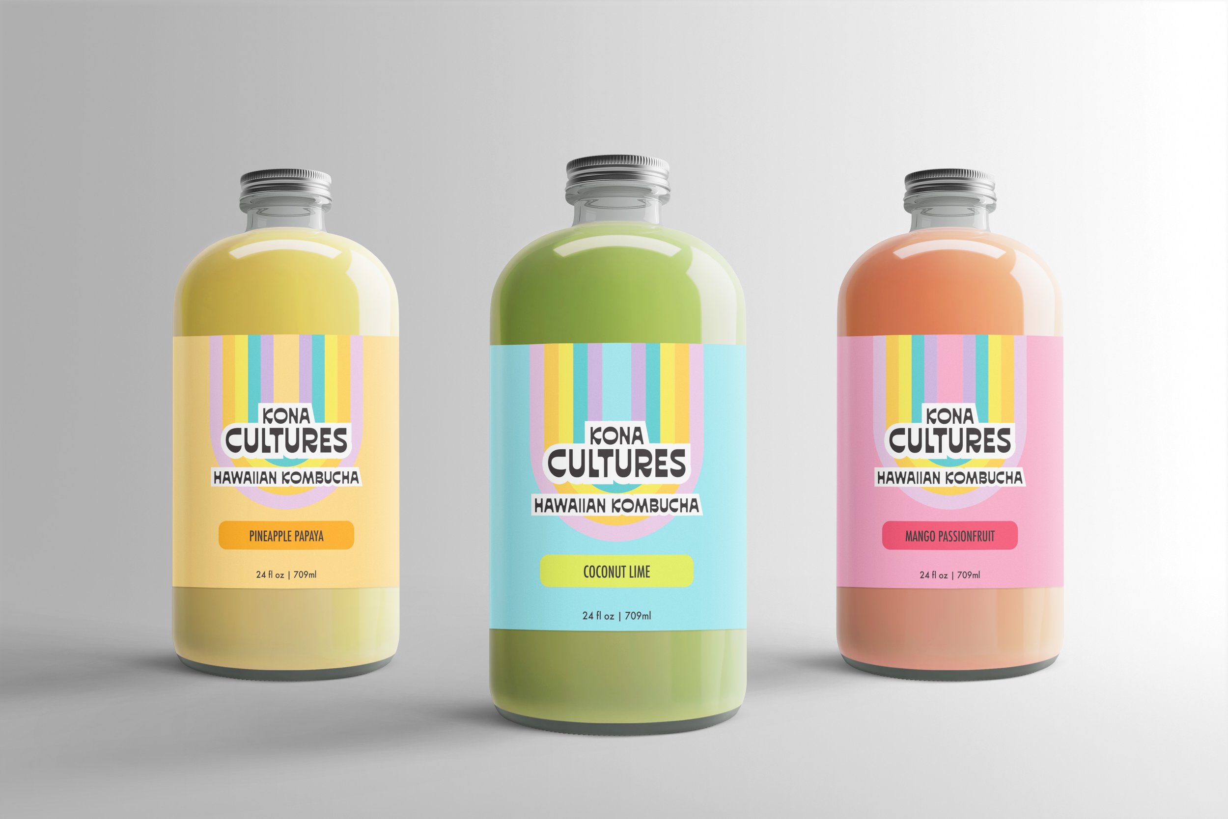
I set out to create a packaging design for a kombucha beverage product from Hawaii to be sold in specialty grocery stores across the US that highlights and educates Americans on native Hawaiian culture. I wanted to bring a taste of Hawaii to 30-40 year olds in the contiguous US with disposable income who are health and earth conscious.
Summary
Using a combination of glass and metal for the packaging creates a high-end feel while an explosion of color draws the consumer in. The sans-serif type choices and hand-drawn elements create a clean, fun, and visually dynamic look. The upside down rainbow adds an element of playful interest and leads the audience to open their minds to a new perspective on Hawaiian culture. I also included a section of the packaging design that educates the consumer on the native Hawaiian language.
Conclusion
This project turned out to be a color explosion and a beverage product that feels like Hawaiian sunshine in a bottle. The main goal of this project was to celebrate native Hawaiian culture and create opportunities for education. I designed a brand equipped with a launching pad for all sorts of other local and national educational opportunities. I can see this brand expanding to sponsoring local Hawaiian events and beach cleanups, nation-wide language classes, partnerships with Volcanoes National Park, and more drink products.


