Franzia Wines
Rebrand & Packaging Design
Objective
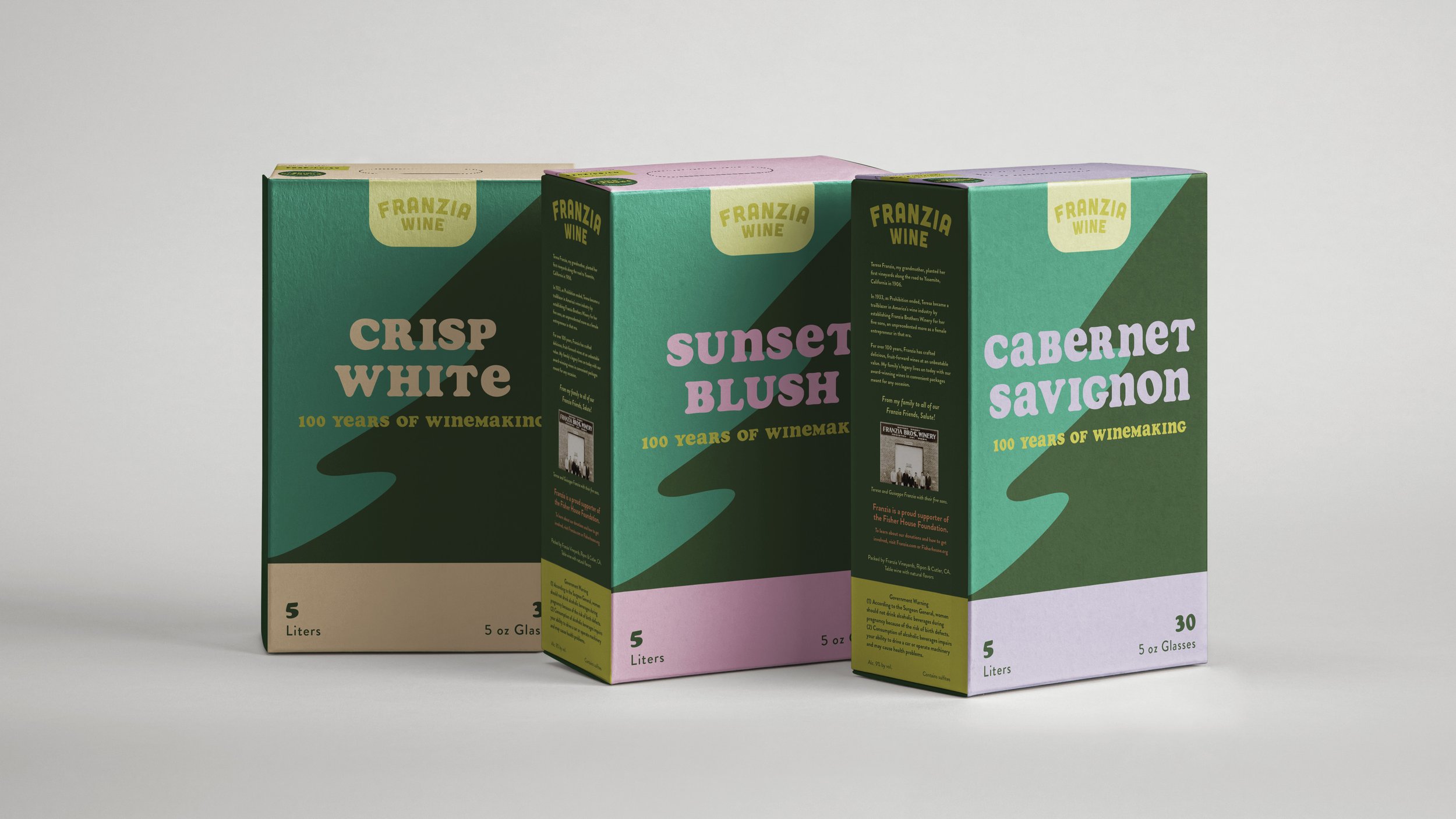
Franzia has been around for over 100 years and has a rich legacy that includes award-winning and innovate wine products. They have a strong commitment to sustainability and also haven’t rebranded their boxed wine packaging since at least the 1990s. I set out to create an updated packaging design that focuses on the portability of the products targeted towards 20-25 year old wine drinkers.
Summary
Franzia’s brand has been brought into the 2020s with a camping-themed design that emphasizes the portability, sustainability, and adventure-readiness of their boxed wine products. A hand-drawn tree illustration combined with an earthy color palette create a sense of outdoor adventure while color-coded wine titles clearly display multiple types of wine. The combination of serif and sans-serif typefaces brings in a balanced sense of fun that speaks to the camping theme.
Conclusion
This project went through what felt like endless rounds of revisions before finally landing on the finished product. In the end, I found a retro-inspired solution that speaks to the new generation of beginner wine drinkers. Creating a whole rebranding campaign around the new packaging design would give Franzia Wines a fresh, new beginning. I can envision this project expanding into social media posts and online ads to target more touch points with that specific audience.


